Shining Starz
Rebrand
August 2026
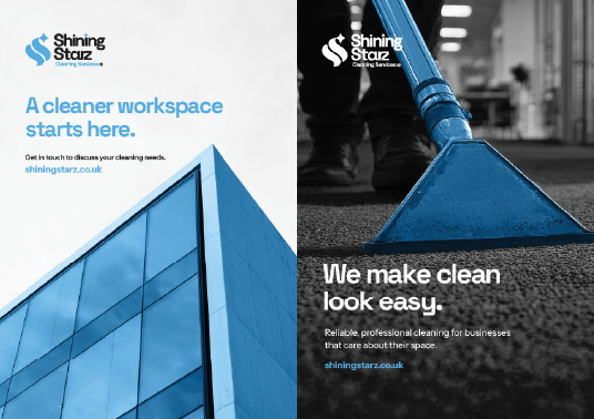
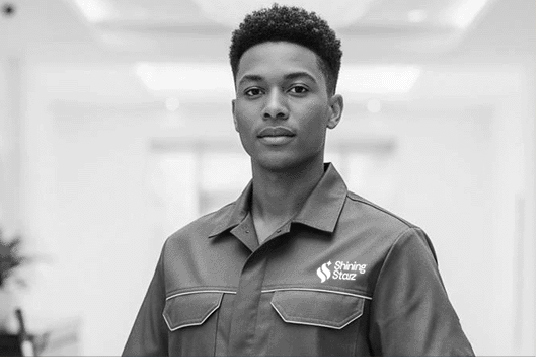
Shining Starz is a premium commercial cleaner based in Birmingham. I was briefed with developing a distinctive identity that will elevate the perception of the business while reflecting its commitment to quality and reliability.
The result is a modern brand identity designed to perform consistently across print and digital applications.
CONTRĀ
Branding
April 2026
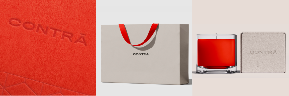
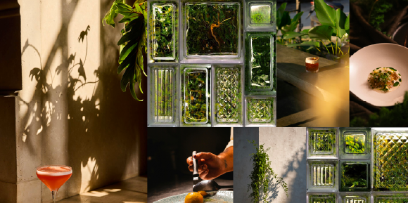
CONTRĀ, a Latin adverb meaning ‘against’ or ‘opposition to’ captures the restaurant’s essence — a harmony of the harsh abrasion of brutalist architecture with nature's serenity. The restaurant fictitiously coincides with luxury hotel Mandarin Oriental, with an identity endowing an aesthetic fusion of tradition with modernity.
CONTRĀ’s identity was envisioned among university peers Alisha Bywater, Hunter Campbell and myself during our second year of study.
A live brief assigned by SEA Design, London.
Restore Eden
Activism Campaign
April 2026
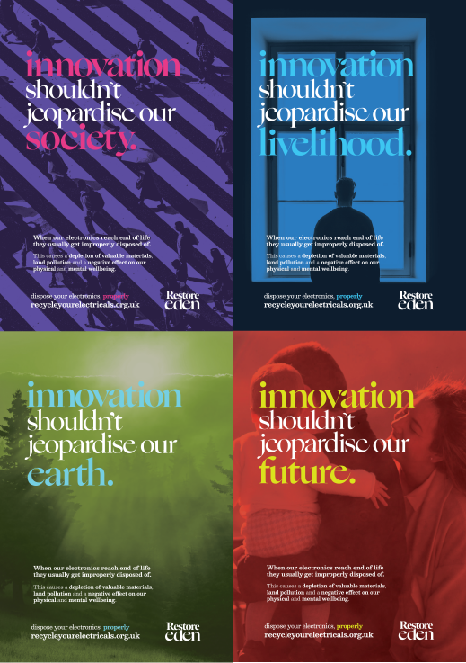
Electronic waste is a dire contributor to land pollution and the scarcity of valuable natural resources — when disposed improperly, the materials are usually burnt or crushed, which is inhaled by us and can potentially make its way into our food, causing adverse effects to our mental and physiological wellbeing. Restore Eden is an activism campaign with the mission of restoring the world to its former state of purity, spreading a message of hope and urgency to halt improper electronic disposal.
A Creative Conscious 2026 submission, under Conscious Consumption.
A Wrinkle in Time
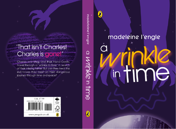
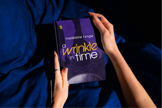
Illustrated book cover
January 2026
A Penguin Books Random House 2026 submission, for Puffin Books.
Time Capsule
App Prototype
December 2025
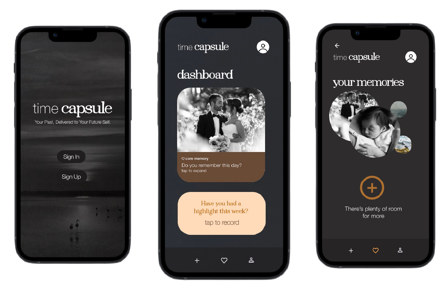
Time Capsule is a memoir app encouraging deep-rooted reminiscence and introspection of the user’s inputted memories with a sentimental and intimate feel, the app is designed to be treated as a virtual scrapbook — a space where memories will never decay and become an heirloom for endless generations. To evoke feelings of nostalgia, a monochromatic palette supplemented by warm earth-tones is present in the app’s design.
An app design project done within my second year of study at Coventry.
Derbyshire
Font
October 2025
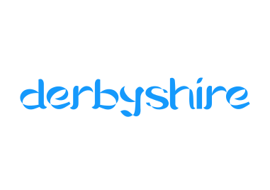
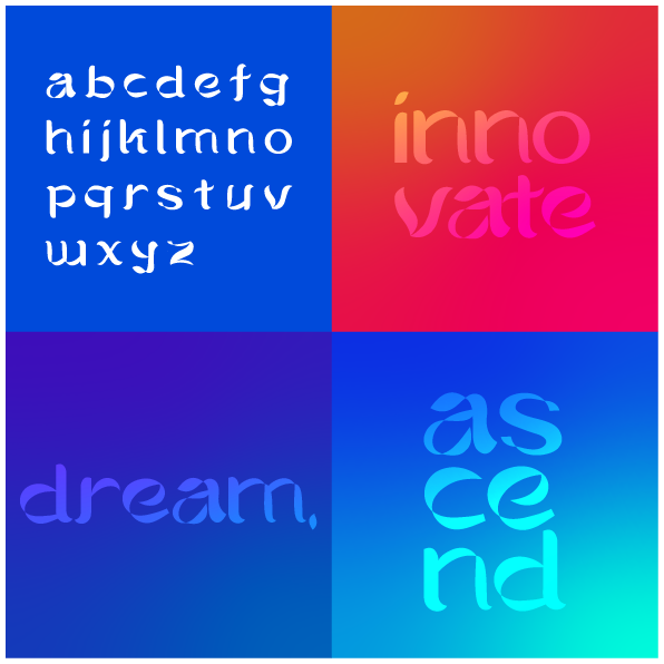
Derbyshire is a display font moved by the innovation of nascent electronic musician Delia Derbyshire; the font is a lowercase Latin glyph set with an asymmetrical and ornate anatomy — an inanimate reflection of Delia’s dynamic, abstract and forward-thinking approach ever-present in her work.
A font design project done within my second year of study at Coventry.
Story of Your Life
Experimental Publication
December 2025
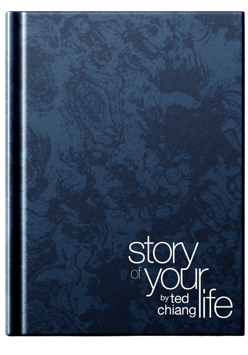
Story of Your Life, a novella by Ted Chiang loomingly delves into a world of native and extraterrestrial life, love and death and the unknown. With a narrative enveloped by obscurity and linguistics, I wanted to make these attributes evident in the publication’s design.
Deliberate use of abstraction to denote these qualities is present throughout, with an inversion of page numbers and typography, giving the reader an unfamiliar experience.
The story has been condensed to accommodate 20 pages, however the chronology and pace isn’t too distinct from the original.
A publication design project done within my second year of study at Coventry.
LINO
Experimental Typography
May 2025
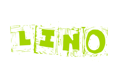
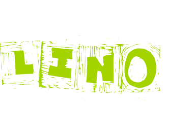
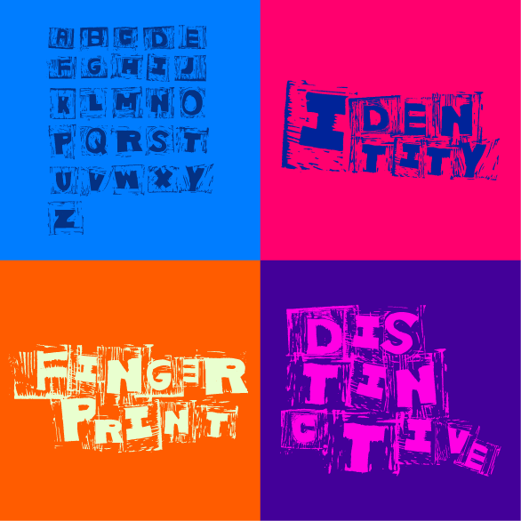
LINO is an experimental Latin glyph set abrasively cut on sheets of linoleum, created intentionally grotesque and defiant of conventional typographic principles; a playful caricature of typography fuelled by the Japanese philosophy of wabi-sabi — the glimmer of beauty found in spontaneity and imperfection.
Innovatoire
Rebrand
April 2025
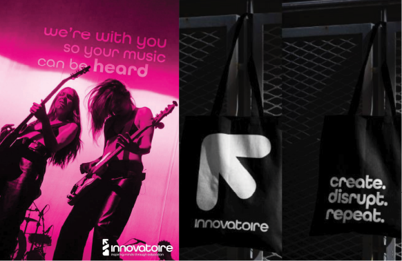
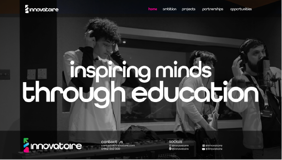
Innovatoire is a community interest company in the sector of music/tech education, catering to a demographic of young people aged 14–18. This was a collaborative endeavour amongst myself and university peers Alisha Bywater and Sohee Shin. Throughout the project’s longevity, I oversaw my talented peers to ensure a strong, cohesive rebrand.
A branding project done within my first year of study at Coventry.
The Edible Campus
Advertising Campaign
December 2024
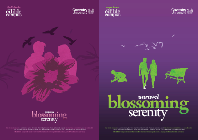
The Edible Campus is a Coventry University garden project opportuning students to freely collect ripe produce and unwind in the serene space — endeavouring to be a haven for mental health and frugality. To capture passersby, I implemented warm, quiet and tranquil visual motifs and copywriting that will spark curiosity.
An advertising project done within my first year of study at Coventry.
Allen Sans
Typeface
June 2024
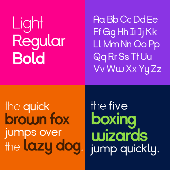
Having a zeal for typography ignited my drive to create a bespoke typeface, a three font sans-serif with 89 glyphs — including the standard Latin alphabet in capitals and lowercase, the numerals and 27 symbols/punctuation.
As a self-declared final project during my BTEC graphics course, I spent most of the project's longevity on research and self-teaching, 2 weeks was spent on the type's development using the font editor Glyphs 3.
HANDS
Experimental Typography
February 2024
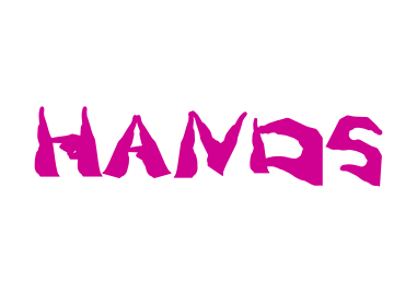
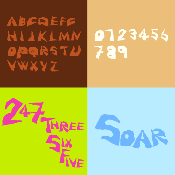
HANDS is an experimental Latin glyph set composed with 4 poses of my right-hand silhouetted, intended to imitate the pivotal letter anatomies — including the stem, bowl, crossbar and arch; they’ve been collated and arranged to form the alphabet and numerals with an unpolished, arbitrary and playful feel.
CGSM
Monogram
March 2024
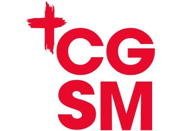
CGSM was a student-led evangelical movement that emerged in Dudley during my final-year at college.
I brought the ministry's visual identity to life through its red monogram logo with a painted cross adjacent, symbolising Christ's suffering.
Alongside CGSM's visual identity, I also made an A5 double-sided flyer showing its weekly activities as well as a gospel tract on the reverse for evangelism.
Human
Pictograms
December 2024
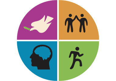
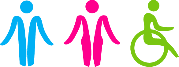
Human was a spontaneous endeavour of reimagining the bathroom pictograms. I approached this project with an ethos of modernity and progressiveness. The forms of both sexes are an allusion to their respective sexual anatomies; the woman pictogram digresses from the traditional skirt, which isn’t as relevant to the dress sense of many women.
The reimagined symbol of access implies the dynamism and independence of mobility impaired individuals with its leaning posture and arm's fluidity, an improvement from the widespread design’s static look.
Mount Shiloh Church
Emblem
January 2024
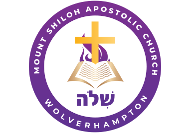
Formed in 1959, Mount Shiloh Church has an eminent history of pioneering innovative and transformative community programmes covering education, employment and physical and emotional health for the people of Wolverhampton.
In late-2023, I contemporised the preceded emblem — enabling ease of use for a wider range of creative applications. Conserving the original emblem's elements in a streamlined and minimal way; depicting the cross, the scriptures and flame with an addition of a geometric Hebrew script that reads 'Shiloh'.
The emblem was rolled out on 2024 New Year's Day.
Mount Shiloh C.H.W.H.
Logo
September 2023
Mount Shiloh Community Health & Wellbeing Hub is an initiative birthed from Mount Shiloh Church, that endeavours to create an oasis for the mental, physical and spiritual health for the Wolverhampton people and refugees. At its inception, I was given the role of creating its logo, outreach collateral and website.
Raven's Rescue
Logo
January 2023
Raven’s Rescue is an animal charity based in Dudley, I voluntarily renovated their logo to establish a creditable presence. The logo features a simplified line drawing of a dog for the mark accompanied with Laro Soft in red for the wordmark — combined, the logo radiates cordiality, capturing the charity’s ethos of approachability and warmth.